📋 Chapter 1: Introducing the My Pet Shop Web App
| Project Goal | Get started with Vue.js by creating a static Pet Shop web app |
|---|---|
| What you’ll learn | Setting up your Vue app, CSS Grid, Styling in Vue, code structure in preparation for moving forward. |
| Tools you’ll need | A modern browser like Chrome. A GitHub account which can be used to login to CodeSandbox. |
| Time needed to complete | 1/2 hour |
What You'll Build
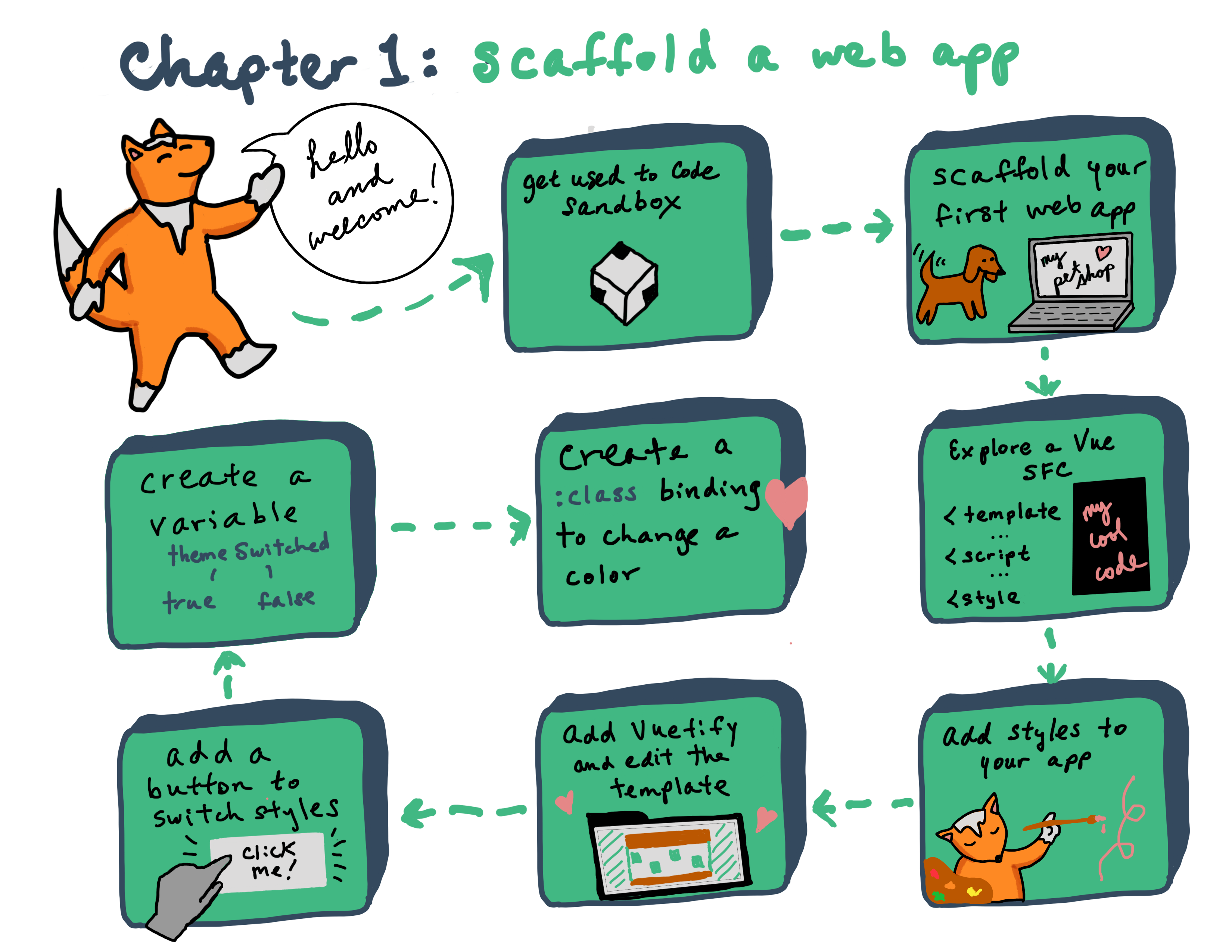
Instructions
Since this is the very first Vue.js web project we're going to make, we'll start from scratch in Code Sandbox. Create a Code Sandbox account and scaffold a starter Vue.js template by clicking here.
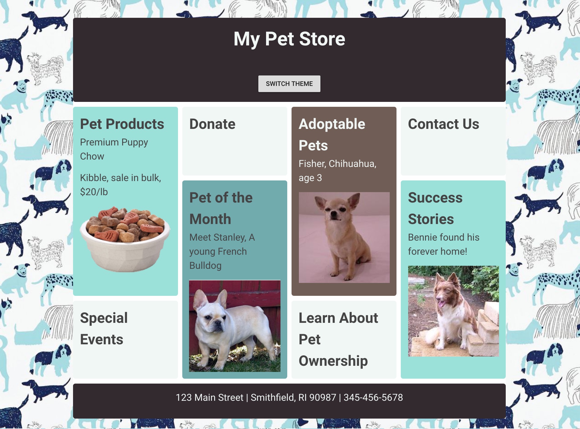
We're going to build a storefront for a fictional Pet Shop that will look like this:
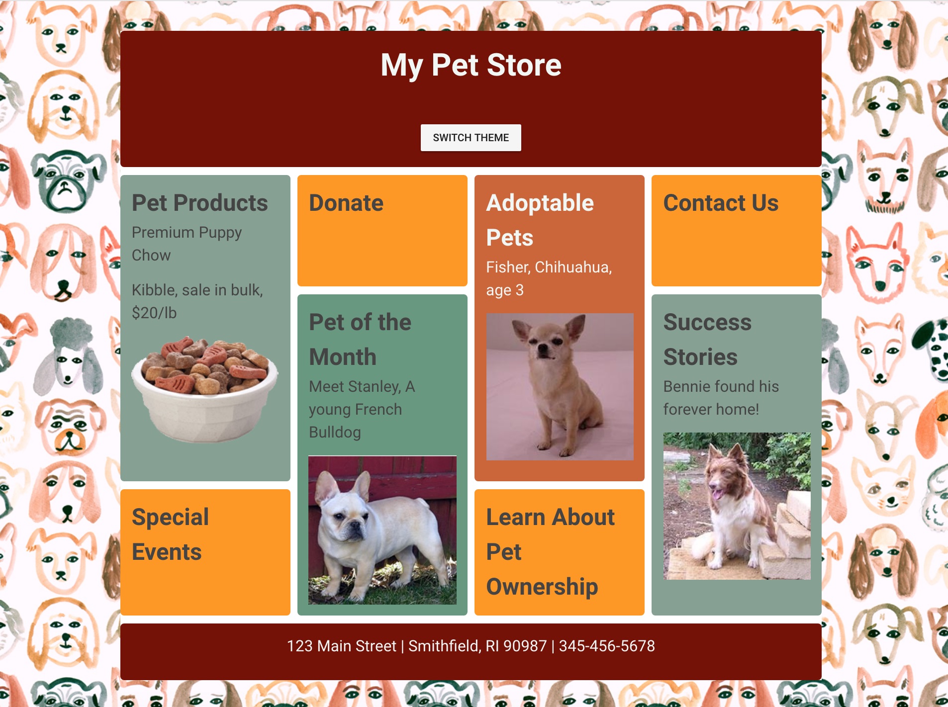
In addition, we're going to create a switch that will change the look of the shop to resemble this:
Take a look at the code that was scaffolded by Code Sandbox for a basic Vue.js app. The first file you'll see is open by default: main.js. This is the main starting point of a Vue.js app. Note that in this file you import Vue from its npm package: import Vue from "vue";. Code Sandbox imports all the needed dependencies from npm to build the app; you can always check out the root package.json to find out which dependencies are needed.
main.js also initializes the app as a new Vue.js app and sets the div into which the app code will be injected, the div with id app. It also defines which component will be used as a starting point, in this case App:
new Vue({
	render: (h) => h(App),
}).$mount('#app');
2
3
Open up App.vue. In this file, the 'home' component is built. It contains the three main parts of a Vue.js Single File Component (SFC): a <template> block, a <script> block, and a <style> block.
Note the first div in the template block has the id app - this is the div where the app code will be injected. There's also a <HelloWorld> component included underneath the logo image. This is an example of an SFC being included into App.vue.
Open components/HelloWorld.vue and you'll find the source of the list of links that appears embedded in App.vue. This file also includes a script block with a msg variable and some more styles in a <style> block.
We're going to rip this sample app apart and recreate it! Let's get started.
Build the Styles
Let's start in App.vue, since we don't have to make any changes to main.js. Add the following style block at the bottom of the file, replacing the current <style> block:
	<style lang="scss">
	@import url("https://fonts.googleapis.com/css?family=Roboto");

	/*brown and mint*/
	/*dark brown 32292F
	light mint 99E1D9
	bisque F0F7F4
	dark mint 70ABAF
	light brown 705D56*/

	*,
	*:before,
	*:after {
	  box-sizing: border-box;
	}

	body {
	  margin: 0;
	  padding: 0;
	}

	main {
	  padding: 40px;
	  font-family: "Roboto", "sans-serif";
	  background: #fff top center repeat;
	  color: #444;
	  background-image: url("https://raw.githubusercontent.com/FrontEndFoxes/projects/main/petshop/images/bg.jpg");
	}

	h1,
	p {
	  margin: 0 0 1em 0;
	}

	img {
	  max-width: 100%;
	  display: block;
	  margin: 0 auto;
	}

	.app-container {
	  max-width: 940px;
	  margin: 0 auto;
	  background-color: #fff;
	}

	.app-container > * {
	  border-radius: 5px;
	  font-size: 150%;
	  margin-bottom: 10px;
	}

	.wrapper {
	  display: grid;
	  grid-gap: 10px;
	  grid-template-columns: repeat(auto-fill, minmax(200px, 1fr));
	  grid-auto-rows: minmax(150px, auto);
	}

	.wrapper > * {
	  padding: 15px;
	  border-radius: 5px;
	}

	.light-mint {
	  background-color: #99e1d9;
	}

	.dark-mint {
	  background-color: #70abaf;
	}

	.light-brown {
	  background-color: #705d56;
	  color: #f0f7f4;
	}

	.dark-brown {
	  background-color: #32292f;
	  color: #f0f7f4;
	}

	.bisque {
	  background-color: #f0f7f4;
	}

	/*orange and green*/
	/*
	dark orange 771100
	orange CC6633
	light orange FF9900
	dark green 689980
	light green 86a193
	*/

	.orange-green {
	  background-image: url("https://raw.githubusercontent.com/FrontEndFoxes/projects/main/petshop/images/bg2.jpg");
	  .light-mint {
	    background-color: #86a193;
	  }

	  .dark-mint {
	    background-color: #689980;
	  }

	  .light-brown {
	    background-color: #cc6633;
	  }

	  .dark-brown {
	    background-color: #771100;
	  }

	  .bisque {
	    background-color: #ff9900;
	  }
	}

	.panel {
	  /* needed for the flex layout*/
	  margin-left: 5px;
	  margin-right: 5px;
	  flex: 1 1 200px;
	}

	.tall-panel {
	  grid-row-end: span 2;
	}

	.app-header,
	.app-footer {
	  flex: 0 1 100%;
	  padding: 15px;
	  text-align: center;
	}

	/* We need to set the margin used on flex items to 0 as we have gaps in grid.  */
	@supports (display: grid) {
	  .wrapper > * {
	    margin: 0;
	  }
	}
	</style>
2
3
4
5
6
7
8
9
10
11
12
13
14
15
16
17
18
19
20
21
22
23
24
25
26
27
28
29
30
31
32
33
34
35
36
37
38
39
40
41
42
43
44
45
46
47
48
49
50
51
52
53
54
55
56
57
58
59
60
61
62
63
64
65
66
67
68
69
70
71
72
73
74
75
76
77
78
79
80
81
82
83
84
85
86
87
88
89
90
91
92
93
94
95
96
97
98
99
100
101
102
103
104
105
106
107
108
109
110
111
112
113
114
115
116
117
118
119
120
121
122
123
124
125
126
127
128
129
130
131
132
133
134
135
136
137
138
139
140
141
142
143
💡
Notice we don't use the attribute scoped in the <style> block. The scoped keyword ensures that your styles will remain valid only for the current SFC, and we're going to make these styles universal. However, we did specify that we are using Sass by adding lang="scss", which is a method of making your CSS easier to manage. Learn more here.
This style block includes a few surprising things:
- It uses paths to external images hosted on Github, rather than relative paths. This is because Code Sandbox doesn't host images; normally you'll just add an image on a relative path such as
/images/myImage.png. - There is some funny 'grid' stuff going on. This style sheet and the template we will build make use of CSS Grid, a new way of making flexible, responsive 'masonry' layouts like this one with stacked 'blocks' of content. Learn more about CSS Grid here.
- There are two style sheets! Or at least two style patterns. One has a green theme, the other is orange. We'll make use of this soon.
Adding the style sheet didn't do much to our template except make the <li> group look strange. Let's fix the template!
Install Vuetify
Before we edit the template, we're going to install Vuetify. Vuetify is a cool library that gives a Material Design styling to your Vue apps. In this chapter, we're only going to use it to create a switch, but we'll use it more in future chapters.
💡
Vuetify is a semantic component framework for Vue. It aims to provide clean, semantic and reusable components for building your application. You can find the default installation guide and documentation for it here.
Install it by clicking the Add Dependency button in the Dependency dropdown area on the left in Code Sandbox (if it's closed, you have to open the Sandbox Info sidebar and maybe you have to scroll!). Search for Vuetify and install it.
Check whether the dependency is installed by opening package.json and checking the dependencies object. It should look like this:
"dependencies": {
	"vue": "^2.5.22",
	"vuetify": "^2.0.19"
},
2
3
4
Next, create a plugins directory inside of your src directory. You'll write a Vuetify initializer file in the new plugins directory.
Once you've created src/plugins, create a new file in the plugins directory named vuetify.js. Inside this new file, add this code:
// src/plugins/vuetify.js

import Vue from 'vue';
import Vuetify from 'vuetify';
import 'vuetify/dist/vuetify.min.css';
Vue.use(Vuetify);

export default new Vuetify();
2
3
4
5
6
7
8
This file is an initializer file for the Vuetify plugin. What we actually do in this piece of code is importing Vue, Vuetify and Vuetify's default styling. By calling Vue.use(Vuetify); we let Vue know that it should use the Vuetify plugin that we are importing. With the export default new Vuetify(); line we are exporting an instance of Vuetify.
In this initializer file, you will be able to import Vuetify's themes, components, and CSS with just two mentions in your main.js file. With this file, the configuration of Vuetify is centralized in one file for the whole of your project.
Open your main.js file and add this code:
import vuetify from '@/plugins/vuetify';
to the 3rd line of the file.
You should now have 3 import statements at the top of your main.js file, that look like this:
import Vue from 'vue';
import App from './App';
import vuetify from '@/plugins/vuetify';
2
3
Next, while still in your main.js file, look for this function block:
new Vue({
	render: (h) => h(App),
}).$mount('#app');
2
3
Since this initializes the Vue instance in your app, you will need to add vuetify here to pass along all the design goods from your Vuetify plugin file.
Add the vuetify variable name from the import statement to the Vue initializer block, just before the render function. Your initializer block should now look like this:
new Vue({
	vuetify,
	render: (h) => h(App),
}).$mount('#app');
2
3
4
In order to have nice icons in our application, we also need to add Material icons to our index.html file. Please open public/index.html and add this string at the end of your <head></head> tag:
<link href="https://fonts.googleapis.com/css?family=Roboto:300,400,500,700|Material+Icons" rel="stylesheet" />
Then, overwrite the current <template> block in App.vue with this markup:
<template>
	<v-app>
		<main>
			<div class="app-container">
				<header class="app-header dark-brown">
					<h1>My Pet Store</h1>
				</header>
				<div class="wrapper">
					<div class="panel tall-panel light-mint">
						<h2>Pet Products</h2>
						<p>Premium Puppy Chow</p>
						<p>Kibble, sale in bulk, $20/lb</p>
						<img
							src="https://raw.githubusercontent.com/FrontEndFoxes/projects/main/petshop/images/food.png"
						/>
					</div>
					<div class="panel bisque">
						<h2>Donate</h2>
					</div>
					<div class="panel tall-panel light-brown">
						<h2>Adoptable Pets</h2>
						<p>Fisher, Chihuahua, age 3</p>
						<img
							src="https://raw.githubusercontent.com/FrontEndFoxes/projects/main/petshop/images/chihuahua.jpg"
						/>
					</div>

					<div class="panel bisque">
						<h2>Contact Us</h2>
					</div>
					<div class="panel tall-panel dark-mint">
						<h2>Pet of the Month</h2>
						<p>Meet Stanley, A young French Bulldog</p>
						<img
							src="https://raw.githubusercontent.com/FrontEndFoxes/projects/main/petshop/images/bulldog.jpg"
						/>
					</div>
					<div class="panel tall-panel light-mint">
						<h2>Success Stories</h2>
						<p>Bennie found his forever home!</p>
						<img
							src="https://raw.githubusercontent.com/FrontEndFoxes/projects/main/petshop/images/collie.jpg"
						/>
					</div>

					<div class="panel bisque">
						<h2>Special Events</h2>
					</div>

					<div class="panel bisque">
						<h2>Learn About Pet Ownership</h2>
					</div>
				</div>
				<footer class="app-footer dark-brown">
					<p>123 Main Street | Smithfield, RI 90987 | 345-456-5678</p>
				</footer>
			</div>
		</main>
	</v-app>
</template>
2
3
4
5
6
7
8
9
10
11
12
13
14
15
16
17
18
19
20
21
22
23
24
25
26
27
28
29
30
31
32
33
34
35
36
37
38
39
40
41
42
43
44
45
46
47
48
49
50
51
52
53
54
55
56
57
58
59
60
Wow, that made a big change! Suddenly, you have a storefront!
💡
Note the use of <v-app> - this is a requirement of Vuetify and is a sure sign you'll have a Vuetify-themed app.
Now we're going to actually use that Vuetify theme by creating a switch. Pressing this switch will trigger a theme switch, so you'll use the 'orange' theme you saw in the styles.
- You might see the
orange-greenclass in stylesheet. Let's add it to the<main>element in the<template>block ofApp.vueand observe how all the colors & background are changed:<main class="orange-green"></main>1 - Now let's try to change the class using Vue class bindings. We can use
v-binddirective or its shortcut:. Replace that simple class in<main>with a dynamic class binding:
<main :class="{'orange-green': false}"></main>
Try to change false to true and vice versa. You can see how class is applied in Chrome dev tools and how the page color theme is changing.
- Get excited! It's time to create your first Vue variable. First, you have to add
data()to your Vue component. This function should return an object of our Vue variables. Let's create one in the<script>block. Overwrite the current<script>block:
<script>
export default {
  name: "App",
  data() {
    return {
      themeSwitched: false
    };
  }
};
</script>
2
3
4
5
6
7
8
9
10
💡
At this point you can remove the HelloWorld.vue component from the components folder as we won't need it.
So, now you have a variable called themeSwitched and its default value is false.
- In the
<main>tag, replacefalsein the class binding with our newly created variable:
<main :class="{'orange-green': themeSwitched}"></main>
Change
themeSwitchedvalue insidedatafromfalsetotrue. Again, you can see the color change effect.Now we only need a switch to change a theme. First we will create a button. We're using Vuetify so it will be a Vuetify button component. We create a Vuetify button with the text 'Switch theme' on it with:
<v-btn>Switch theme</v-btn>. Let's place it in theheaderright after theh1tag:
<header class="app-header dark-brown">
	<h1>My Pet Store</h1>
	<v-btn>Switch theme</v-btn>
</header>
2
3
4
Now add a click event handler to our button. We can use
v-ondirective or its shortcut@. This handler will changethemeSwitchedvalue to its opposite value, toggling the color-changing class.<v-btn @click="themeSwitched = !themeSwitched">Switch theme</v-btn>1
Test your application by clicking the button. Looks nice, right?
Congratulations! You've just finished Chapter 1!
Final result